
It’s not a very hot take to say that Apple’s “professional” colours have always been on the duller side. Each year, the Pro version of the iPhone comes in various neutral metallic shades, along with one or two unique colours for that year’s model.
These limited edition colours haven’t strayed very far from the tried-and-tested formula of desaturated and dull. The trend started in 2019 with the release of the Midnight Green (has midnight ever really been green..?) iPhone 11 Pro. This continued with the Pacific Blue iPhone 12 Pro, which was a dark teal. The closest we came to a bright colour was 2021’s Sierra Blue on the iPhone 13 Pro – although lighter, it remained stubbornly lacking in saturation. Apple were edging towards at least something slightly bolder with the spring refresh of the iPhone 13 Pro in Alpine Green – a slightly brighter, slightly more saturated version of the colour used for the 11 Pro. However, recently, they seemed to have firmly run back towards the left of their HSL sliders with the it’s-blue-in-very-bright-lighting-but-mostly-looks-like-dark-grey shade of Blue Titanium on the iPhone 15 Pro.
When putting the colours (taken from Apple’s colour selector on the Compare iPhone models page) across each year together, it paints a picture not dissimilar to a late period Rothko painting…1
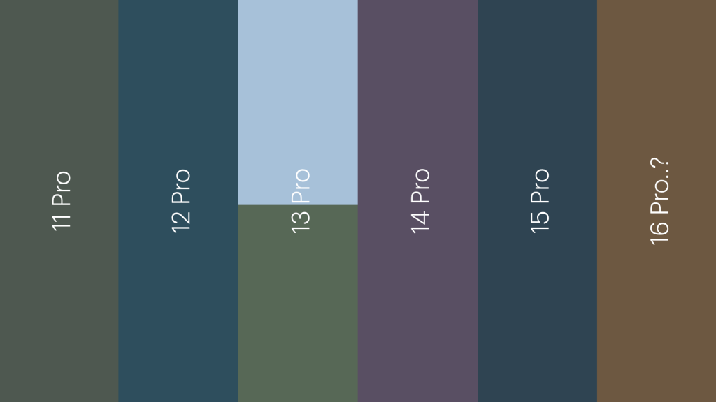
Although rumours about colours are notoriously unreliable, I’ve included the rumoured bronze or brown finish that has been allegedly shown off in dummy units of this year’s iPhone 16 Pro:
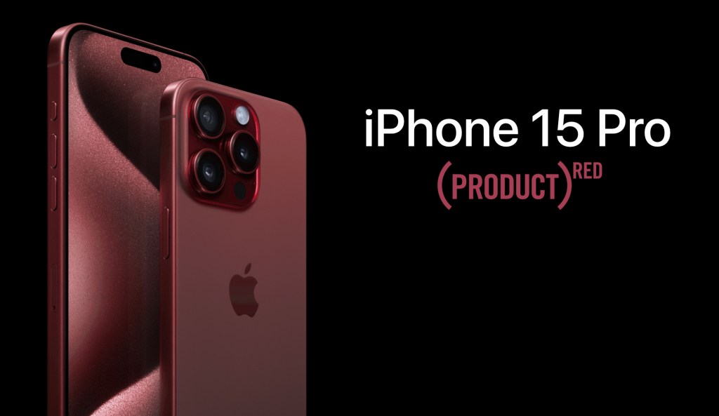
One quirk that has always struck me as odd when considering Apple’s commitment to (PRODUCT)RED is that there has never been a red flagship iPhone on launch day. The iPhone 7 got a mid-cycle refresh, but that marked the only point where you could buy the top-tier model in the colour. Since then, it has been reserved for the non-Pro variant and the iPhone SE.
It’s a shame, as this mockup created last year shows the potential of a red titanium-and-frosted-glass design, even if it is less vibrant than many people would like:
Why, then, does Apple stubbornly refuse, year after year, not to give customers at least the option of a snazzier coloured phone? Is it because they believe adding an option with a semblance of fun would dilute their “professional” branding? Is it so the colours don’t fade out of fashion, and so is actually part of their Longevity, by Design strategy…? One day we may find out – but that day doesn’t look to be soon.
- I have excluded Natural Titanium from the iPhone 15 Pro, as rumours suggest it is sticking around this year too. ↩︎

Leave a comment