
The future of computing is spatial – at least that’s what Apple would want us to believe as they release their newest and arguably most important product since the iPhone next month: Apple Vision Pro. It will sit alongside Apple Watch and AirPods as a key marker in the history books of, rightly or wrongly, how Tim Cook’s product legacy as CEO will be remembered.
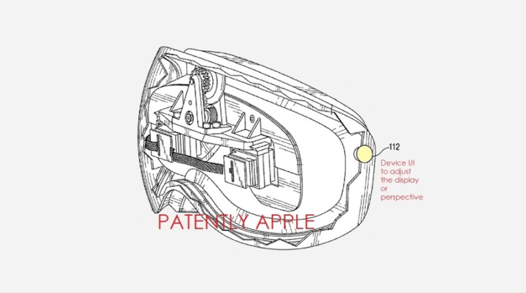
According to patent filings, Apple has been working on initial ideas for this headset – one which they hope will redefine how we work, communicate and entertain ourselves – since at least 2007. The filing shows a device which, if you squint well enough, isn’t entirely dissimilar to the $3,499 device previewed at WWDC last year (although there are only so many guises a bunch of screens and cameras strapped to your eyes can take!). What is interesting, however, is even back in 2007 Apple were envisioning (no pun intended) a button which would adjust ‘the display or perspective’. Now, this patent filing is not necessarily proof that Apple had working prototypes, or even a plan to launch such a device – patents are granted all the time for inventions that are neither proven to work (see this patent for glasses to project subliminal messages to the wearer), nor likely to ever appeal to the public (see this patent for a device someone could be strapped to to facilitate childbirth using centrifugal force). And some patents are just plain bizarre – see this filing for a ‘method of swinging on a swing’. Although the merits of the patent system can be debated (see ATP episode 566), what this filing does suggest is that someone, somewhere in Cupertino was thinking about what a head-mounted device could look like and how it should work over a decade and a half ago.
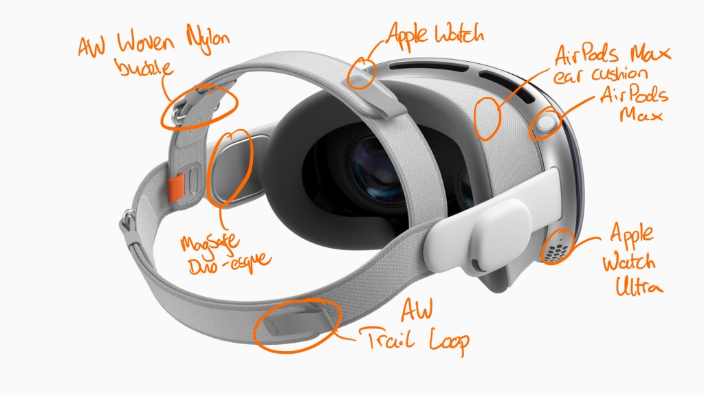
It’s no surprise that Vision Pro was a long time in the making. However, what is apparent in the final device which is shipping in February to those lucky enough to grab one is that it takes heavy design cues from multiple existing products. Just like how the iPad was on the drawing board of Steve Jobs’s office before the iPhone was even dreamt of, only someone on the inside could know how many of these design features were originally conceived for Vision Pro and recycled for other products versus the other way around. Nonetheless, it’s clear that Apple are unifying not just the design language but specific design elements across disparate product lines more so than ever before. The two greatest donor products are, perhaps surprisingly, not the iPhone, which has been the main historic avenue for Apple’s AR attempts, nor the iPad, which lends its app ecosystem to the device. Instead, it’s Apple’s only other wearable products: Apple Watch and AirPods. Specifically, Apple Watch Ultra and AirPods Max.
Design Influences
The Digital Crown
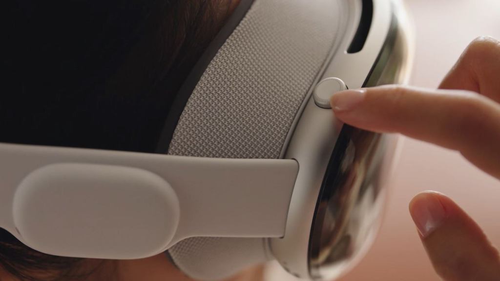
It doesn’t take a genius to realise that the Digital Crown is not a Vision Pro-specific input control. This marks the third distinct product to use it after the Watch and AirPods Max. Interestingly, no product uses the dial in the same way: on the Watch, it is primarily used to scroll content and return home; on AirPods, it is used as a simple volume control and music control button; and on Vision Pro, it will be used to control how immersed the wearer is, as well as bringing up the app grid (this notion of returning to a default state – be it the app grid or silence – is perhaps the only common thread between its uses).
As an aside, the fact that Apple plays fast and loose with what this control does is interesting. Sceptics might suggest that because the Digital Crown has not been as revolutionary and UX-defining as, say, the iPod’s click wheel, Apple have more license to adapt how it is used in each context. Harsher critics may argue that the use of the Digital Crown outside the scope of the original concept shows a lack of imagination, and a cost-cutting exercise of delving into the parts bin instead of thinking more radically about interfaces for possible user interaction. Is it really the best experience to tie the control of your immersion in Vision Pro to a small dial which you have to feel around for, instead of, for example, a more expansive gesture system? It remains to be seen how well the Digital Crown can adapt to the spatial computing era. How ever it ends up working, the fact that Apple is sticking to this specific design element shows a certain belief in its usability and adaptability. Where else could this control show up? Will we ever see a Digital Crown on an iPhone to control volume, and double as another Action button? Could it be used as a physical jog wheel on a future Siri Remote? What about a future Apple Pencil to adjust line thickness or to select different brushes and tools? I think these ideas are a little far-fetched, but Apple’s comfort in treading a blurry line around what a ‘Digital Crown’ does at least raises interesting possibilities.
The specific Digital Crown on the Vision Pro is clearly inspired by the AirPods Max – it is a larger, more pronounced version than the control which originally debuted on the Watch. The insert in the crown is also white – this design touch was originally found on the gold and rose gold Apple Watch Edition models which were bundled with a white Sport Band before also showing up on the silver AirPods Max some years later. (The original Apple Watch Edition was also the only non-cellular watch which would come with a red crown insert – all models matched their crown to the bundled band, and therefore the $17,000 – that’s almost 5 Vision Pros! – model in 38mm with a Bright Red Modern Buckle was a little preview of what was to become standard on all cellular watches almost two and a half years later with the Series 3.)
The Ultra Influence
The Apple Watch Ultra and Apple Vision Pro are two devices with perhaps the most diametrically opposed intended use-cases out of all of the products in Apple’s current lineup. Marketing images for Apple’s flagship watch show people climbing mountains, diving into the depths of the ocean and cycling on rugged off-road tracks. It’s the only device which Apple seem to think is enhanced by being shown covered in dirt and grime – it is a rare departure from presenting every device as clean, perfect and being used in simple, neat surroundings. (The only times I can recall Apple glorifying this before in recent memory is in certain TV ads – for example, the beaten up MacBook Air being plastered in stickers in a 2014 ad or advertising iPhones as being immune to spills and drops – but the marketing of the Apple Watch Ultra embraces this on a totally different level.) In complete contrast, Apple Vision Pro isn’t even really meant to be used whilst moving, never mind on the top of a mountain (a real mountain, rather than the immersive Mount Hood environment you can go into!)- and that’s why the fact that these two products share so many design elements is especially interesting.
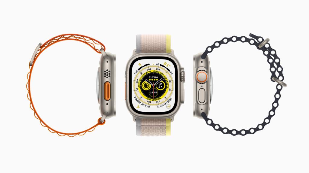
There are 3 noticeable influences from Apple Watch Ultra on Vision Pro: the use of orange accents on the product; the precisely-milled holes on the bottom of the device; and perhaps most obviously, the bands which secure the device to the user’s head. The Dual Loop band in particular is essentially a scaled-up version of the Trail Loop, and utilises anchors for the part of the strap which adjusts the fit that bear more than a passing resemblance to the buckles used on the (now discontinued) Woven Nylon and leather Classic Buckle bands. Coincidence? Perhaps. But it wouldn’t be a surprise if these design elements did trace their lineage back to the watch. Apple’s watch bands have been a huge success, both in terms of aesthetic design and in terms of how well they work for users. It’s the latter point which the Vision Pro must emulate: unlike the Apple Watch, this is not a fashion accessory – or at least it won’t be for the foreseeable future, until the technology is shrunk down into something which far more closely resembles a standard pair of glasses. I doubt we are going to see new Vision Pro head straps released which are solely designed to look good. Maximising comfort and adaptability has to be the top priority if this truly is to be a device we wear for hours at a time, multiple days a week.
Other commentators have pointed out that the Dual Loop band in particular looks rushed, as if Apple wanted to go with the objectively nicer-looking Solo Knit band as the only option, but discovered it did not adequately support the weight of the device for some users. If we assume this was the case – that the Dual Loop was not the result of years of planning, but a hotfix – what could future, more refined bands look like? One avenue Apple may choose to go down is taking more of the weight of the device off the face using a ‘halo’ style strap which rests primarily on the user’s forehead. This is more inelegant: it creates a larger footprint, and this style of strap tends to be rigid rather than flexible. It is a trade-off that Apple may wish to consider, however, if they keep true to their idea that this is a device you should be using for hours at a time to get ‘real work’ done.
It is also interesting to consider how the Vision Pro’s design may donate elements to future donor products. Apple’s recent move away from leather should be applauded for environmental and ethical reasons, however the replacement FineWoven material hasn’t exactly been met with rapturous praise. Could we see, for example, a Solo Knit-inspired watch band which combines the comfort of the existing Braided Solo Loop with more adjustability in the form of a miniaturised Fit Dial?
More Tenuous Links
AirPods Max and Apple Watch Ultra were clearly the main muses for designers working on Vision Pro. However, there are other products which share at least a passing similarity to elements of the headset. The audio pods on the head strap use a familiar white, soft-touch material inlaid with metal. This is reminiscent of the MagSafe ring in Apple’s now discontinued MagSafe Duo charger, and is similar – or perhaps the same – material as Apple’s Magic Keyboard for iPad Pro.
The Lightning connecter also makes a disfigured appearance not just once, but twice – derivatives of this now-obsolete product are used for connecting the cable to the silver aluminium battery, and also for connecting the white straps to the Vision Pro itself.
The Future
As the Apple Vision product line grows and matures, I look forward to seeing how many of these design inspirations were proven to be well-judged, and how many get left by the wayside, especially as the line expands into more affordable options. The Vision products will inevitably find and define their own distinct design language as Apple learns more about what works and what doesn’t. Until then, I look forward to experiencing a product which is the culmination of over a decade’s experience in designing wearable technology – it’s plain to see that Vision Pro is but another descendent down a carefully planned family tree.

Leave a comment